MvoPlus Sample Screen 1
DATA Mode

Description
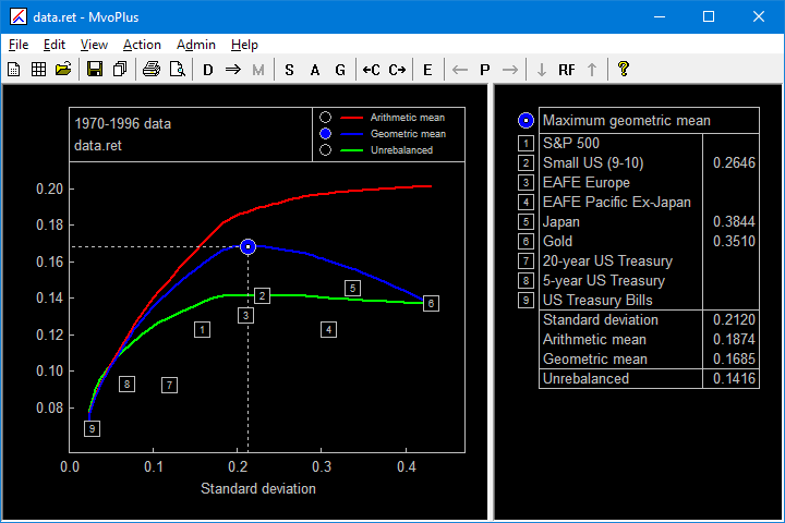
The main MvoPlus screen, showing the efficient frontier plot on the left, and the properties of the currently selected portfolio in the table on the right.
In this example MvoPlus is functioning as a back-tester and approximate optimizer of historical data. The three curves represent the properties of the "efficient portfolios". These portfolios are constructed to maximize the arithmetic mean return when the portfolio is rebalanced at the end of each year. To a good approximation they also maximize the rebalanced geometric mean return. The geometric mean return of the rebalanced portfolio is shown in the blue curve. The green curve shows the return of the corresponding unrebalanced portfolio.
The selected portfolio is the one with the maximum value of the geometric mean; its properties are shown in the table on the right. In the plot, the currently selected feature (note the blue check mark in the legend) is the geometric mean, and this is the feature that is displayed for each asset (the numbered squares on the plot). The properties of each asset may be displayed in the table by clicking on the corresponding symbol on the plot or table.
The following points may be of interest: